10 Tips to improve website and its look and feel
- February 13, 2016
- Web Design, Web Solutions
One of the most frequently asked questions is: “How can I drive more visitors to my site”. The answer to the question of generating good revenue is how well your website design is and how your web pages appear. The success of your website layout lies in easy navigation, user friendliness and high functionality. Here we discuss 10 Tips to improve your website and its look and feel:
1. You’re website should be fast
One of the main reasons for the downfall of a website is when it loads too slow. Even if your site takes 20 seconds to load- that means a lifetime on the internet- and most people don’t have the time and patience to wait for that long. Understand that wild graphics and animations are traffic killers and only use them if you really have to. Make sure you design your website so that everyone can view- not only the ones with high speed internet connection. If your website takes more than 10 seconds to load, chances are that you may be losing more than half of your site’s traffic.
2. Easy navigation
This is one of the most important and simple tips to improve a website. Statistics show that websites lose more than 50% of site visitor’s every time they have to click on a link to find a page. Make sure that all your web pages are not more than five clicks from the home page.
3. Make your website mobile-friendly
More than half the population owns a mobile now and half of that percentage uses Smartphones, so there are chances that your potential clients will land on your site from mobile browsing. But it’s very tough to browse a website that is not optimized for a mobile screen. This is another important factor for improving a website and there are plenty of ways to create a mobile version for your current website.
4. Your website should match your company branding
If you update your company logo or colours, make sure it matches your online presence to create brand awareness and also make it easy for customers to recognize your company online.
5. Never overdo Pop-ups
A lot of webmasters overuse pop-ups thinking that it will help customers make more purchases but that’s not the case. You’ll probably lose a potential client if you have pop-ups everytime they open or close a window or click on a link. Use pop-ups only to offer customers and site visitor’s something of high value and something that they will be really interested in.
6. Make sure to use appropriate colours and fonts
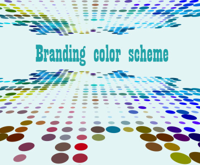
A simple and clean looking website is creative enough to improve the look and feel of your site. Throwing all kinds of colours in your site is overwhelming and can put site visitors off. Remember, nothing is easier on the eye than black text on a white background. Use small amounts of colors and have your website looking elegant which is more appealing to the eye. Also make sure to have fonts that can be easily read on any device or browser. Check this infographic about which illustrates How your branding color scheme can affect your website visitors.
7. Incorporate Social Media widgets
Including social media widgets will help your business and website become available to customers whenever they need to check any updates about your site. The widgets shouldn’t be the most prominent feature in your site but they shouldn’t be hard to spot either.
8. Use images to your advantage
Images play an important role when people search for something on the internet. A lot of web users are simply attracted to websites that have optimized images and clean, well photographed images can enhance your business or service much more than words can.
9. Interact with customers
Interacting with customers, both present and potential is very important in any business. With this in mind, consider supporting interaction among the web readers and with you where having a comment box where they can easily exchange suggestions.
10. Never forget your purpose
And finally, the most important factor to improve your website: remember your purpose of having a website. Each page of your site should be connected with the purpose of having a website. All your images, graphics, colours and links should help you achieve what you wanted from having a website in the first place. If you want more sales and to promote your business or service, you have to go for a sales-oriented website instead of one that is just nice-looking. The bottom line is beauty alone won’t achieve everything. Design your site in a way that makes site visitors interested in what you have to offer. Make sure you choose the right website that suits your purpose.
Contact our solutions Expert to find out the ideal website you need to have for your business. You may also request a free quote.
About us and this blog
We are a digital marketing company with a focus on helping our customers achieve great results across several key areas.
Request a free quote
We offer professional SEO services that help websites increase their organic search score drastically in order to compete for the highest rankings even when it comes to highly competitive keywords.


